Take it from me; there are PLENTY of design mistakes that will drive you insane after you complete your home build. I’ve made a few of these, and the internal frustration of having to live with them every day is unmatched. I’m here to help you avoid making them! Many of these mistakes occur in the space we use the most… the kitchen. Here are five kitchen design mistakes and my tips for avoiding them!
1. Protruding Appliances
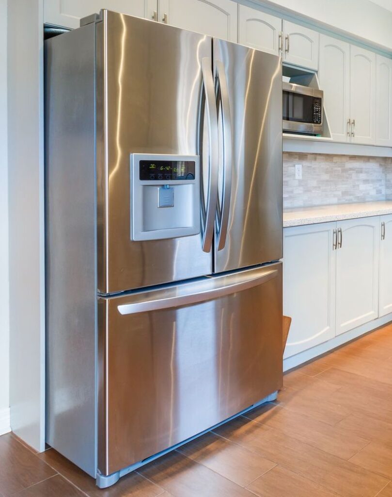
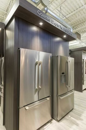
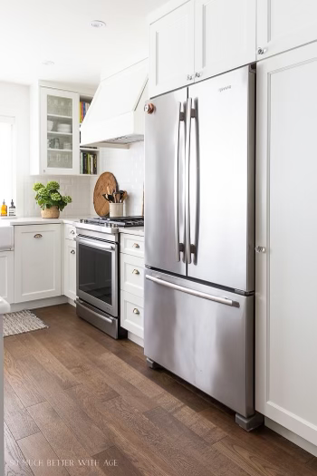
There’s nothing worse than having a stunning new kitchen and then realizing that your fridge is completely sticking out. On some occasions, even 1/2 an inch can cause a visual discrepancy in the overall aesthetic of your kitchen. Take a look at the photo below and notice the difference between a standard fridge and a counter-depth fridge.
Fix: Measure, everything twice prior to purchasing appliances and make sure the measurements are consistent. Consider the fridge size when designing your cabinets or buy a counter-depth fridge (24”-27” deep). You can also add a bump out to your plans to account for a standard-size refrigerator.
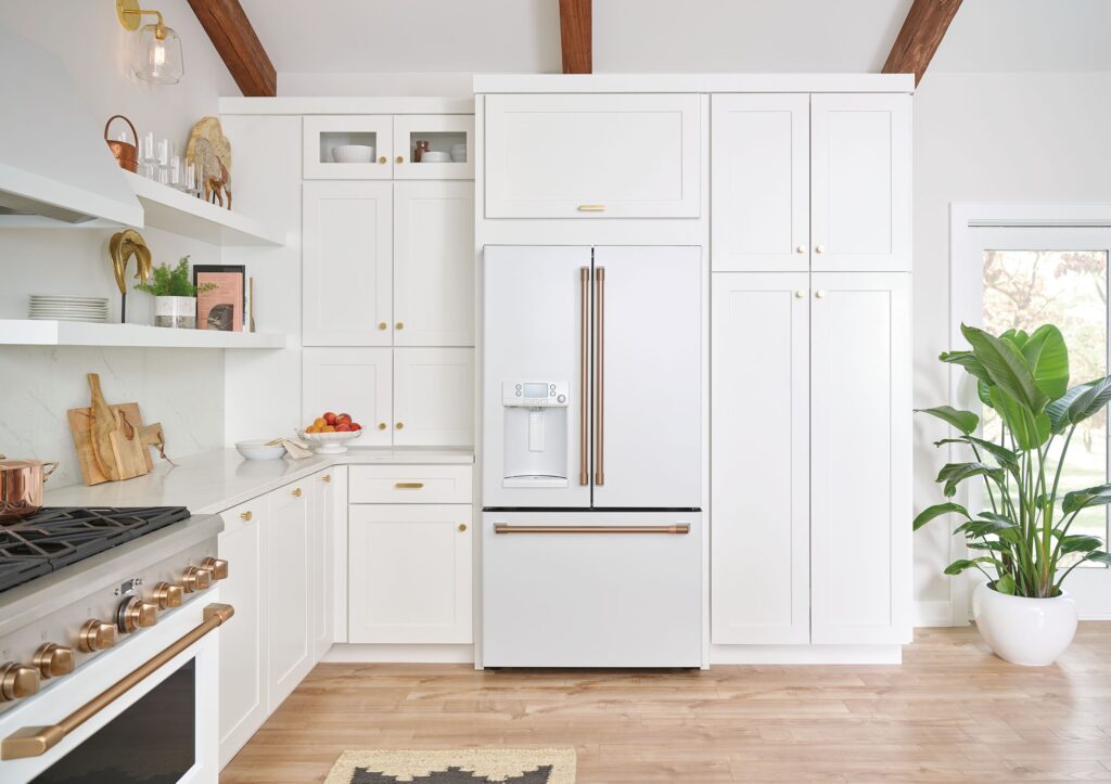
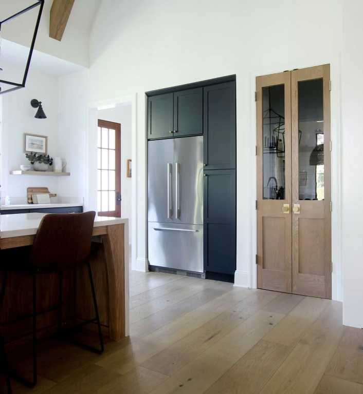
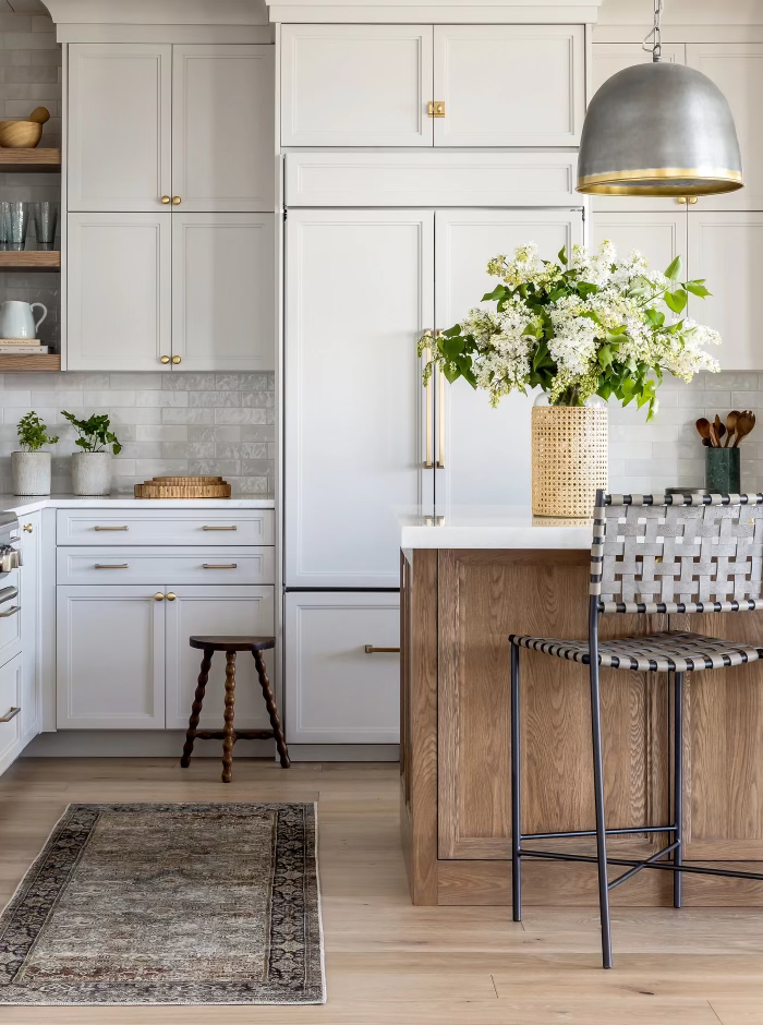
This may be a pricey option, but you can also hide your appliances altogether by making them panel ready! Look how seamlessly they blend into the rest of the kitchen. This is an elevated aesthetic and is simply *chef’s kiss*.
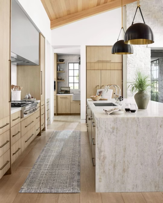
2. Poor Kitchen Layout
Always consider how you work in the kitchen. You don’t want to be running a marathon each time you’re unloading the dishwasher or prepping in your kitchen. You want everything to be easily accessible and easy to reach to make your life easier. Unloading the dishes after a long day of work will be less annoying if everything is where it needs to be.
Fix: Plan for storage solutions like spice racks and spatula holders near your range. Trash pullouts should be near your dishwasher and sink to make clean-up simple. Personally, I like having my dish storing cabinets either directly in front or behind me to make emptying the dishwasher a breeze.
3. Low Cabinets
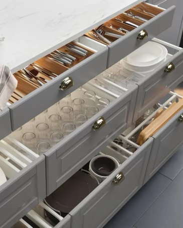
Let’s be honest, low cabinets can be frustrating. They’re hard to access, hard to get to and if there’s stuff in the back, you’re probably never going to find them.
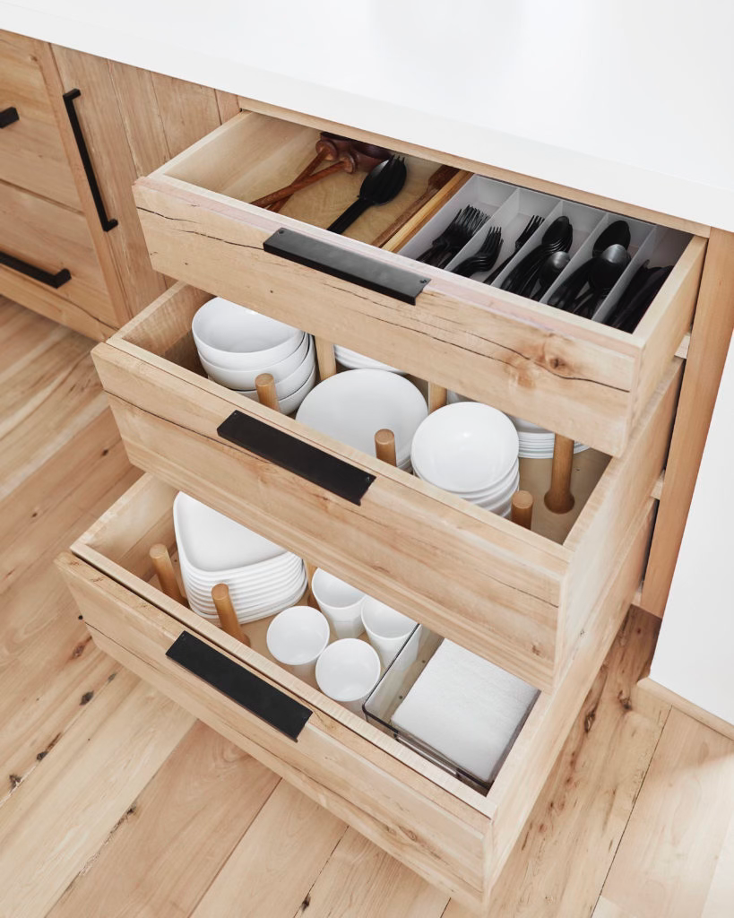
Fix: Add deep pull-out drawers instead of cabinets! If you have cabinets you can’t change, then I’d suggest adding storage solutions to make access easier.
4. Not Enough Storage
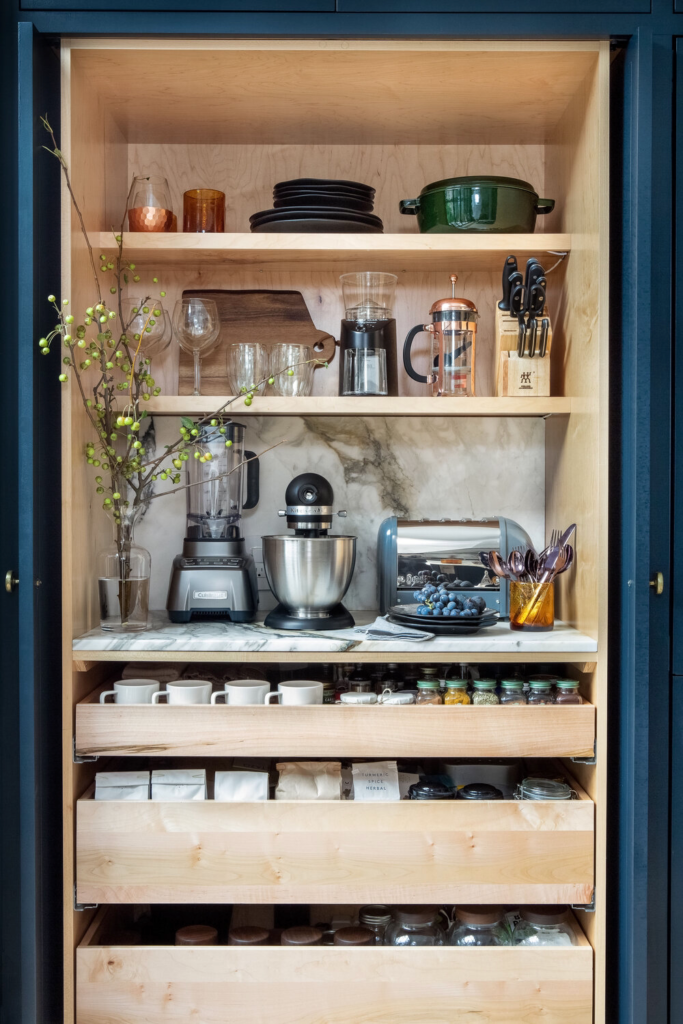
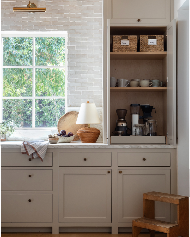
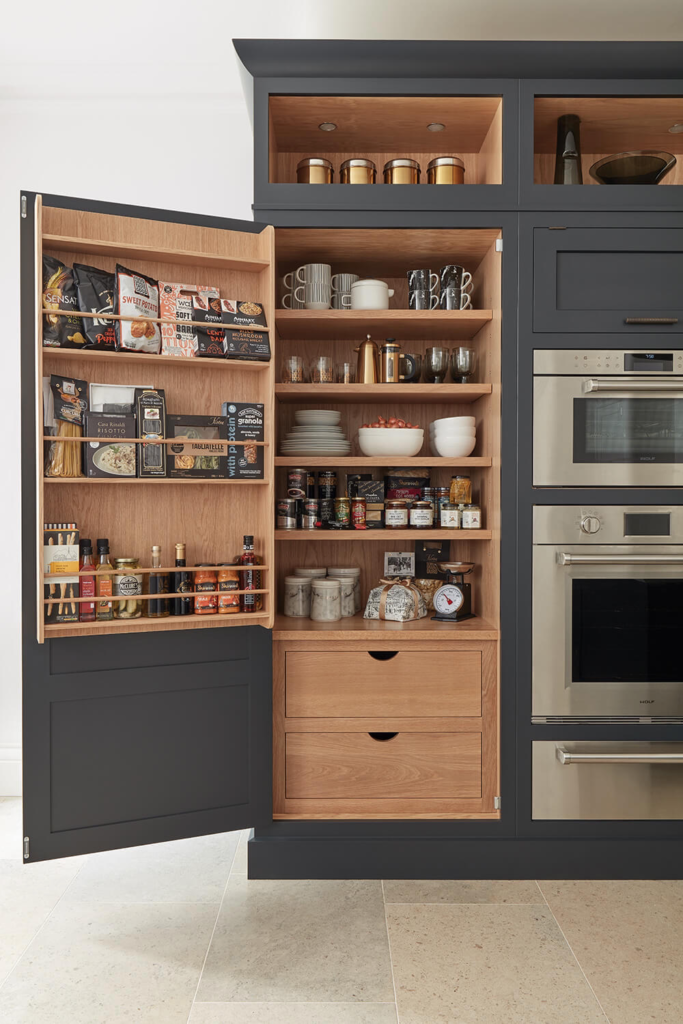
When building a kitchen, the first thing we think about is our dream of a huge island. Stop. Think about your storage necessities first! Kids’ items, containers, bakeware, and cookware all need a convenient place to live to make your life easy.
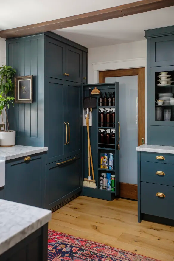
Fix: Don’t forget to add storage solutions for things like kids’ essentials, appliances you don’t use often, seasonal items, etc. Add easy pull-outs for daily cleaning supplies and other items you reach for constantly.
5. Poor Lighting
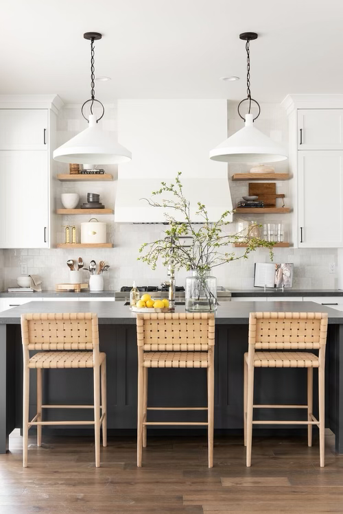
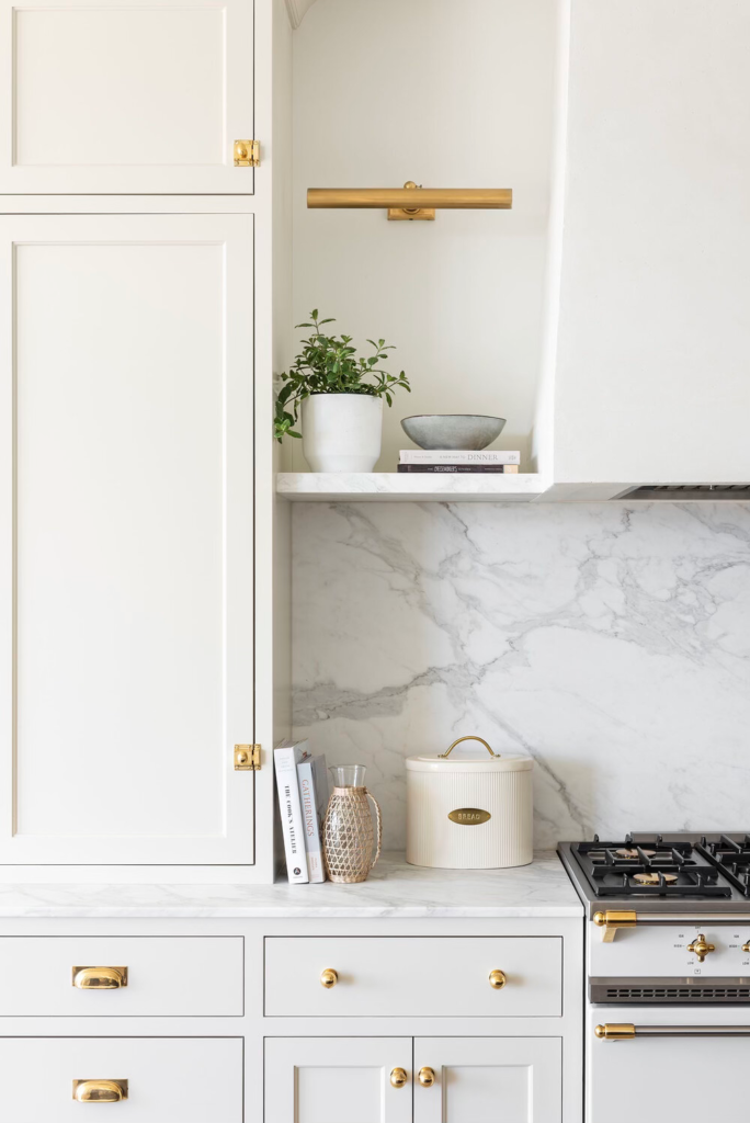
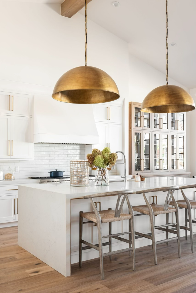
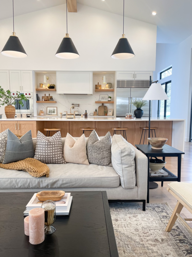
Pretty lighting is great up until you realize you can’t see anything. There are two types of lighting you can use in the kitchen: Statement lighting and task lighting. Statement lighting includes sconces, island pendants, and aesthetic lighting. Task lighting should be what you’re installing to see everything clearly. Can lighting, or recessed lighting is what you’re going to use to light up the entire space.
Fix: Make sure you have cans on separate switches so the space is well-lit when needed and able to be dimmed when not. In the photos below, notice the addition of pendant lighting, sconces, and recessed lighting in the ceiling.
I’m sure there are more to add to this list but these are the top five kitchen design mistakes I hope I’ve helped you to avoid in the future!





[…] building or remodeling, I have tips for other spaces in your home as well. Take a look at my blog: Five Kitchen Design Mistakes, and learn how to NOT make […]